


More than 50 percent of eCommerce sales in the UK now take place via a mobile device, with mobile revenue in the US exceeding $1 billion in one day on Black Friday.
In a transcript from the Profitero Podcast Series, Profitero’s Director of Strategy and Insights EMEA Andrew Pearl speaks to Oliver Bradley, global eCommerce Design Director at Unilever.
Andrew and Oliver discuss how mobile is changing the way consumers shop, ways to improve the online shopper experience through mobile ready hero images (conversion is proven to be stronger from mobile ready hero images than standard conventional pack shots), and some of the significant uplift in sales that Unilever-owned brands such as Magnum have experienced since implementing these images.

AP: Thanks for joining us today Oliver. Please tell us some of the areas that you cover in your role as eCommerce experience design director.
OB: Sure, it’s a really varied role and something I really am enjoying. One of the key areas is just how to create a better experience for our brands online. More of our business is shifting online and if we end up with worse market shares online than in-store we are going to have a problem. We dream up innovative ideas to make the user experience better, looking at everything from images and videos to what text we should display. We also collaborate with retailers in terms of what functionality they’re going to be adding so we can try to get ahead of the curve.
AP: Can you explain why it was necessary to focus on “hero images” for eCommerce?
I think we recognized we needed a fresh approach in creating great primary images for eCommerce that work on mobile, based on two things. Firstly, we recognized mobile is the first screen, or experience, for our brands. We noticed that traffic first went mobile towards the end of 2014 and in the UK, we’ve actually seen eCommerce reaching a tipping point on mobile where 50% of transactions are now carried out via a mobile device.
Secondly, we also recognized the current mobile experience was miserable and it was leading to poor conversion rates. That’s a big challenge for retailers because you’ve got shoppers wanting to move and use their mobile to shop, instead of using a desktop or laptop, but the experience is sub-optimal and wasn’t leading to the conversion that both us and our retail partners would want.
To cut a long story short, we approached Cambridge University. There’s actually a little interesting story behind that. I noticed that Cambridge University had worked on Gov.UK, the Government website in the UK which is where you can get your car tax and do your income tax return. They had won a design award in 2014 for Gov.UK, which was slightly unusual because they beat the beautiful Shard Building in London. I thought “I really need to see this team and I need to see how they helped Gov.UK win this award and understand what they did.” I guess the story started there.
What they managed to do was is make the website really accessible to as many people in the UK as possible. The bare bones simplicity of it astounded me and I was like “You know what? We need to do that. We need to make online shopping really accessible to as many people as possible, particularly older shoppers”.
AP: I know a lot of our listeners would be interested in the specifics of how you went about this research. Can you share one or two of the key insights that then drove your recommendations?
OB: People shop online because they want to save time Andrew. It’s a convenience thing. Mobile, on top of that, has changed the way people shop. I mean look at your own behavior. I’m sure you browse products while you wait to be seated for dinner at a restaurant. If I look at families in restaurants it seems that everyone in the family is looking at their phone. You know if you’re catching the train to work everybody’s got their head in their mobile. People are using their mobile to compare prices online even when you’re in the store. We kind of did some broader research about shoppers expecting to be able to do everything on their mobile.
We did some more specific research in terms of eye tracking. What we realized first off is shoppers avoid reading. They tend to only look at images when they shop online. This is pervasive across desktop, tablet and mobile. It’s not unique to mobile and tablet at all. There was the first observation and it was a big piece of research. Sixty odd eye tracks followed by another mobile eye tracks.
The second thing we discovered is that shoppers scroll really fast. Obviously the other little insight there was that the younger the shopper is the faster they scroll. Maybe that’s because they’ve grown up with Instagram and Facebook and are used to furiously looking through their newsfeed to see what’s interesting. We even have this little phrase in Unilever about “thumbstopping creative.” We worked with a world renowned design agency, JKR in London, to help us. Together with Cambridge University we worked out that the foremost important bits of information that shoppers require are brand, format, guarantee, and size.
AP: For most brands they might just think “Okay. For my primary image, the main image I use for eCommerce, that’s just got to be my pack shot right?” How did your hero images differ from the standard pack shot?
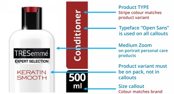
OB: I think the best way of explaining it is to basically make it simpler and cleaner and easier to verify brand format. The way to do that actually is not to use photography. If you’re forced to use photography and you can’t afford to get the layered digital artwork, then you can medium zoom crop, usually across the middle or the top of the pack shot, so that the brand’s bigger, the format’s bigger, and the variant is easier to see.
One of the things that a hero image always does is that size is represented off the pack so that you don’t make that mistake. I think secondly, in almost all cases, we generally advise to crop so that the online mobile shopper can actually see things a lot better. The hero image, in essence, is a medium zoom crop of the central top of the pack and then we’ve taken the technical text off the pack. You’re probably saying “Well Ollie, what do you mean by technical text?” Well technical text is not our marketing copy. Format such as “Is it a body wash? Is it a shampoo? Is it a conditioner?” That’s a technical description. In fact, it’s a category keyword or search keyword.
We made a decision early on that for the the hero image, the only text that was permissible off pack would be size and format. Essentially we’d be doing a de-cluttered medium zoom render of the image. It’s a digital render. It’s not actually a photograph at all.
AP: For shoppers to be able to see it, how important is it for them to actually see the product?
OB: That’s a great question. I think there’s an opportunity for some brands to show off the aesthetically beautiful product inside. Now it’s probably not going to be important to squeeze bleach out of the blue bottle. I wouldn’t advocate taking the lid off some of our products but certainly on Ben & Jerry’s it works because our ice cream has taste appeal when you look at it in the raw, so to speak. Lids off can work very effectively on some of our food products, however that isn’t the key.
I think the foundational thing was the Cambridge testers saying “If you took a twenty-three millimeter image and you held it at a hand’s length away from you on a tablet, could you recognize the brand format and variant, and can you read size at about a meter away?” We call that level one at Unilever. If you can’t achieve level one don’t even think about doing level two or level three, the clever stuff on your images in terms of taking off lids and doing mobile first iconography.
My charge to all our brands, we’ve got sixty brands in Unilever, is: You all have to achieve level one of ‘The Cambridge University Inclusive Design Test’: at a meter away on a 23 millimeter image can you recognize brand, format, variant, and size?

AP: I know among our listeners there’ll be a wide range of sophistication. Some, as you say, will just be looking at the basics and therefore that is a great test to gauge their products on. Then taking it forward, stage two, three, and four, what would be some of the highly developed images that you’ve developed for some of your brands that have really pushed the boundaries in terms of product content?
OB: In terms of mobile, there are already hero images that are the best. On Magnum we’ve taken the product out of the pack, particularly the mixed Magnum minis. Taking the product out the pack and laying it diagonally across the pack to save space because you only have a square is good. We actually have an Instagram feed for Magnum and you’ll see a lot of people holding their Magnums out in different parts of the world. Just this iconic Magnum with this beautiful background! It is an icon in itself and a kind of industry standard for a handheld ice cream.
Then, sticking the number of servings on top of the ice cream like that made it really easy for the shoppers. It did two things. One it was aesthetically beautiful. Two it solved the “How many Magnums am I getting” thing. If you look at the Magnum Hero image we’ve cleaned the pack up. We’ve made the M bigger for Magnum so you can see “Minis” is a lot bigger. We’ve called them out, so it’s obvious we’ve got the classic, the almond, and the white in there so you can see the difference. Variance is a lot easier to see.
AP: I think one of the key takeaways is to keep it simple, showing the brand, the format that the shoppers want, and some very simple icons. Are you able to share some of the uplifts that you’ve seen since implementing these images?
OB: Absolutely! I spoke about Magnum. That was a test with a French retailer where we got a 24% uplift. We’ve done another test in Europe on the number of washers on laundry. All we did was add the number of washers and we got a 2.6% uplift by doing that. On Simple, with an American retailer, we got a 19.6% lift in an A/B split test. The other case study that we have is of Ben & Jerry’s, the one we spoke about with the lids off, and we’ve actually made the branding bigger and the variant bigger. That was with a UK retailer and we got a 3.6% lift by having hero images instead of standard pack shots on that. Again A/B split tested.
It’s been gratifying to see our research is driving conversion and fixing the conversion issue on mobile that I mentioned at the start. We’ve discovered a shopper first solution, we’ve open sourced it. You can find it if you go to my profile on LinkedIn and it links you straight through to the Cambridge University website which has open sourced their lozenge design for everybody to use.
AP: I don’t think I’ve ever come across a company, in my previous 15 years in category management, to be so willing to share a great piece of research. You must have come across a few internal challenges when you said “I’m going to share this. I want everyone to follow these same recommendations.”
OB: The challenge around open sourcing our research has been a big one for me. Fortunately Keith Higgins, who I report to, is very supportive. He knows the right thing for the industry. He knows that mobile is already the number one platform for eCommerce both in developing and developed worlds and he’s more interested in us providing thought leadership for the industry than just always taking the competitive advantage for ourselves. Because I think we need to get ourselves to the position where retailers trust us to come up with industry solutions rather than selfishly keeping all of the benefits for ourselves. Behave like a true category expert rather than only have the interest of your brand at heart.
AP: I know for those of our listeners who haven’t seen your open source information they’ll be desperate to get hold of it. You mentioned your LinkedIn profile. If people want to get in touch with you or find out a little bit more, what’s the best way of doing that?
OB: LinkedIn is quite a useful way just to get hold of me. The other way to get a hold of us as an eCommerce team is to reach out to us on Twitter where our Twitter handle is @eCommerceULVR.
To hear other industry thought leaders discuss the most important eCommerce trends impacting the CPG and retail sector today, listen to the Profitero Podcast Series.